The Hidden Benefits of Panorama Photography
Since the early days of film, panoramic photography has been synonymous with landscape and architectural images, and sometimes with other genres like street and wildlife photography. By combining two horizontal frames of film, typically 120 medium format, some film cameras actually shot panorama photographs by design. Most of these cameras emerged in the latter half of the twentieth century, bringing the panoramic format to the public eye. The panorama had existed long before this time, of course, but its popularity has only grown — and with good reason. Panoramas are fun and dramatic, and their subtleties are just as important in today’s mostly-digital age as they were during the heyday of film. In this article, I will discuss some of the important but less-common benefits of taking panorama images, as well as sharing a set of my photographs from Iceland in the classic 6×17 aspect ratio.
Some of the positives of panoramic photography are obvious. By stitching several frames into a panorama, you can take wider-angle photos than your lenses typically allow. For landscape and architectural photographers especially, an ultra-ultra-wide perspective is always useful. Of course, many photographers simply like the extra resolution that comes from stitching several frames together — it allows for larger, more detailed prints, along with more cropping ability in post-processing. Even the relative uniqueness of a panoramic frame has some appeal, since most photographs are taken without switching from the camera’s native 2×3 or 3×4 format (or perhaps the Instagram-famous square aspect ratio). However, there are more benefits to panoramic photography than what may first meet the eye.
NIKON D800E + 105mm f/2.8 @ 105mm, ISO 100, 1/6, f/9.0
1) Composition
I briefly discussed the compositional benefits of panoramas in my article on balance, but it is worth going into more detail here. For starters, consider the image below.

Brief Note: One of the many benefits of writing for Photography Life is that I get to show my abstract circle art to thousands of unsuspecting viewers whenever I write an article about composition. I’m bad at Photoshop and I’m even worse at abstract art, but I’d be lying if I said I didn’t enjoy this.
In the sample above, you can see that this image is poorly-composed. Ignore the fact that I can only draw circles in Photoshop, and notice how crowded the frame is along its edges. If this were a real landscape, the logical decision might be to zoom out slightly to give more breathing room on either side of the image. Unfortunately, zooming out is not always an option. In this abstract example, the boring white space continues indefinitely above the frame, and the foreground is ruined because — of course — someone littered. The best way to fix your abstract composition, then, is to photograph this frame as a panorama.

Here’s the panorama, just for kicks.
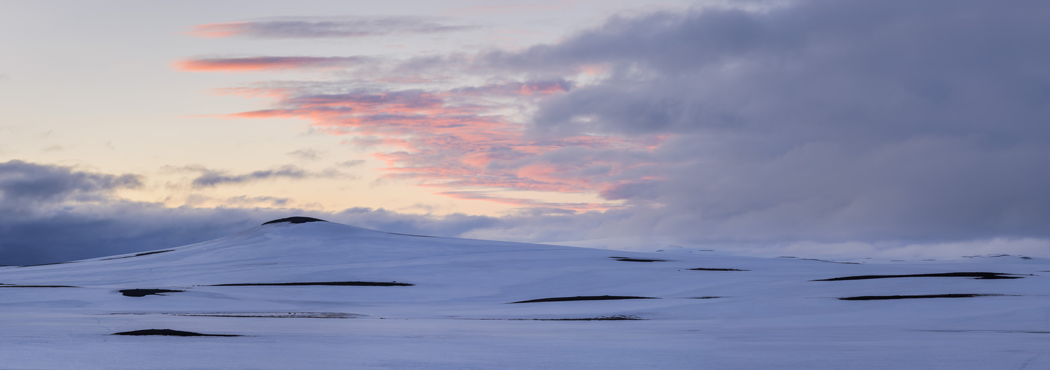
A real-world example is shown below. In this image, the sky and ground were entirely featureless — foggy and silhouetted respectively. Although I could have used a 2×3 aspect ratio and zoomed in a bit more, I would have had to crop out the sides of the mountain to do so, and the image would not be as strong.
NIKON D800E + 105mm f/2.8 @ 105mm, ISO 100, 1/2, f/11.0
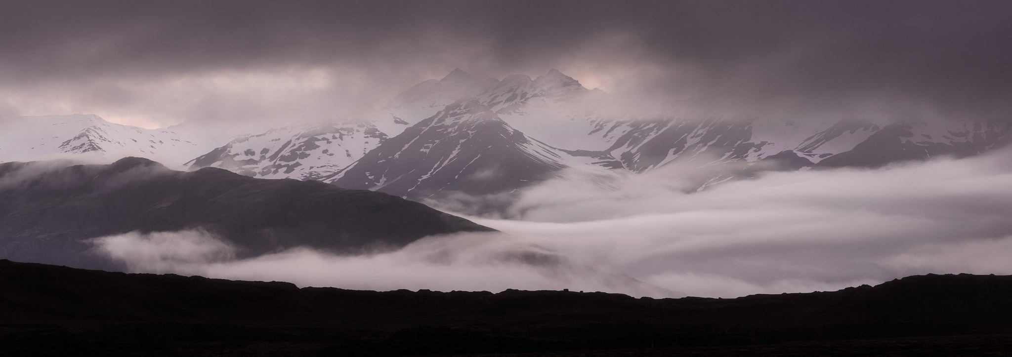
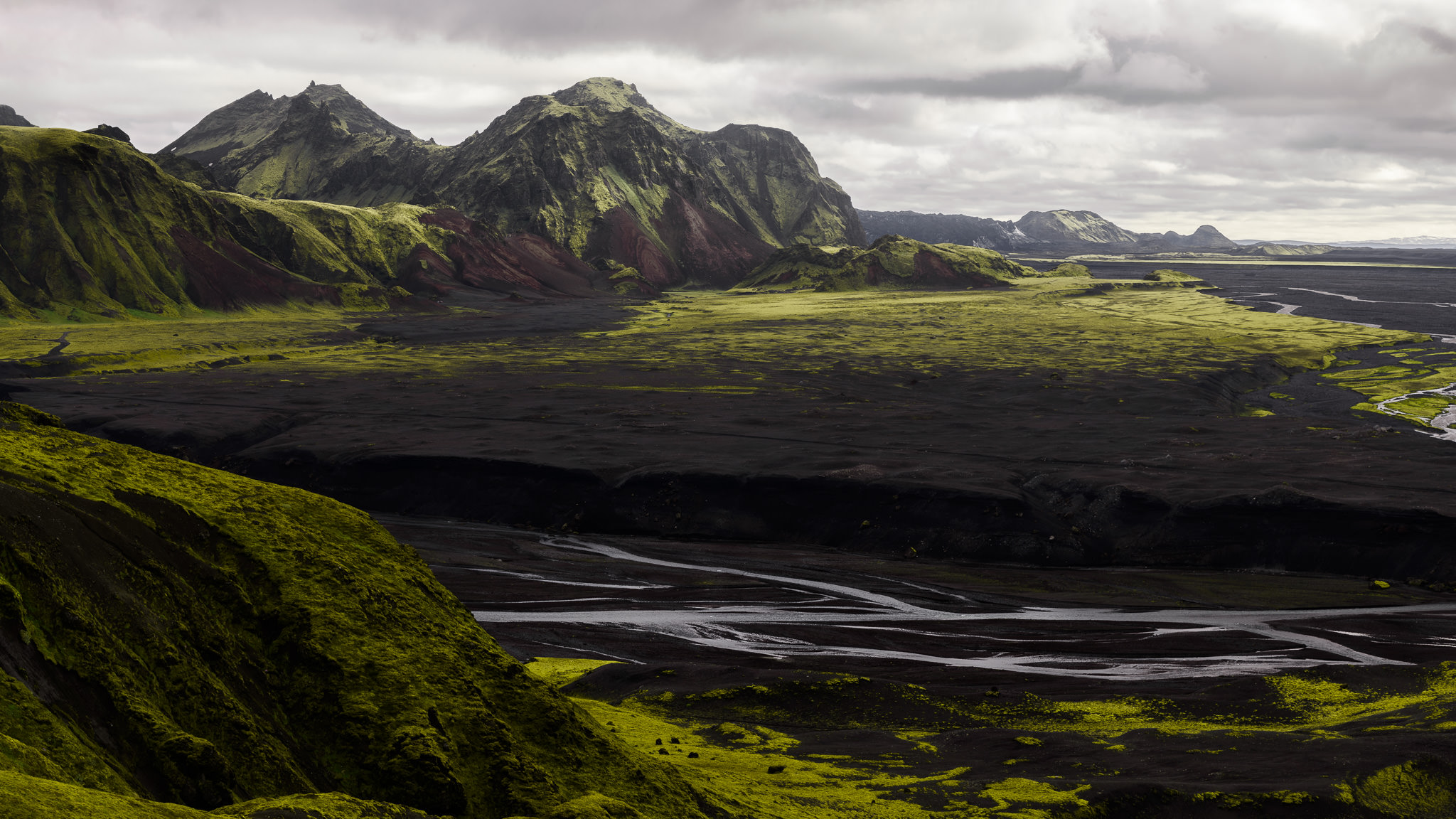
Along with the extra room for composition, the panoramic format makes it easy to balance the items in your frame. A panorama is inherently so wide that it is very difficult to tip off-balance, which certainly is not the case with traditional rectangles. Even bright, attention-seeking items in your frame are not nearly as important when they take up a small percentage of the image. In the panorama below, for example, the largest bright area is directly along the right-hand side of the photograph. Normally, this would be a textbook example of imbalance. However, the sheer number of other items in the frame — most of which would not be visible in a 2×3 or 3×4 photograph — render this bright spot of sky almost inconsequential to the image’s overall balance.
NIKON D800E + 105mm f/2.8 @ 105mm, ISO 100, 1/6, f/11.0
The compositional side of panoramic photography certainly is not the only reason for its popularity, but panoramas are useful for images that cannot be composed in more typical ways. Often, I use the panorama format simply because the spaces above and below my subject would boring with a 2×3 frame — other times, I do so to make my image easier to balance. Panoramas are not ideal for every composition, but they are crucial tools in more situations than you may think.
2) Large Prints
I briefly mentioned the increased detail that comes from stitching several images together — and such detail certainly is welcome — but it is not the only reason that you can print larger images from the panoramic format. Consider a typical (high-end) photo printer: the width of the print is set at a certain size (since, say, a 24-inch printer simply cannot fit anything larger), but the length of the print is essentially unlimited. The reason is that, past a certain size (typically 13×17), photo paper tends to come in rolls rather than sheets. These rolls can be tremendously long, often more than fifty feet (15 meters).
The implications for panoramic photography are clear. If your roll-paper printer works up to 24 inches (60cm), the size of your frames is only limited to your photo’s aspect ratio. If your file has a 3×4 ratio, for example, you can print no larger than 24×32 inches. A 2×3 frame gets you to 24×36 inches, whereas a 1×2 image can print up to 24×48 inches in size. If your roll isn’t out of paper yet, a 1×3 panorama can be printed at a massive 24×72 inches in size. The numbers themselves are not particularly important here, but the size differences are — once you hit your printer’s limit, a 1×3 panorama can be exhibited twice as large as a 2×3 image.
Even third-party printing companies work the same way. At Bay Photo, for example, the maximum size for a 2×3 ratio print is 30×45 inches (75×115 cm). But, if your image has a 1×4 aspect ratio, you can get a 30×120 inch print — that’s ten feet wide (three meters) on the long side. For most photographers, a print of this size is never going to be a practical option. However, even smaller prints benefit from a panoramic aspect ratio.
Above most sofas and beds, for example, the wall is wider than it is tall. Quite often, the difference is significant. And, for landscape photographers who want to sell their work, home decoration is one of the largest markets. It makes sense to cater to people’s needs, then, and panoramic art is disproportionately popular for bedrooms and living spaces.
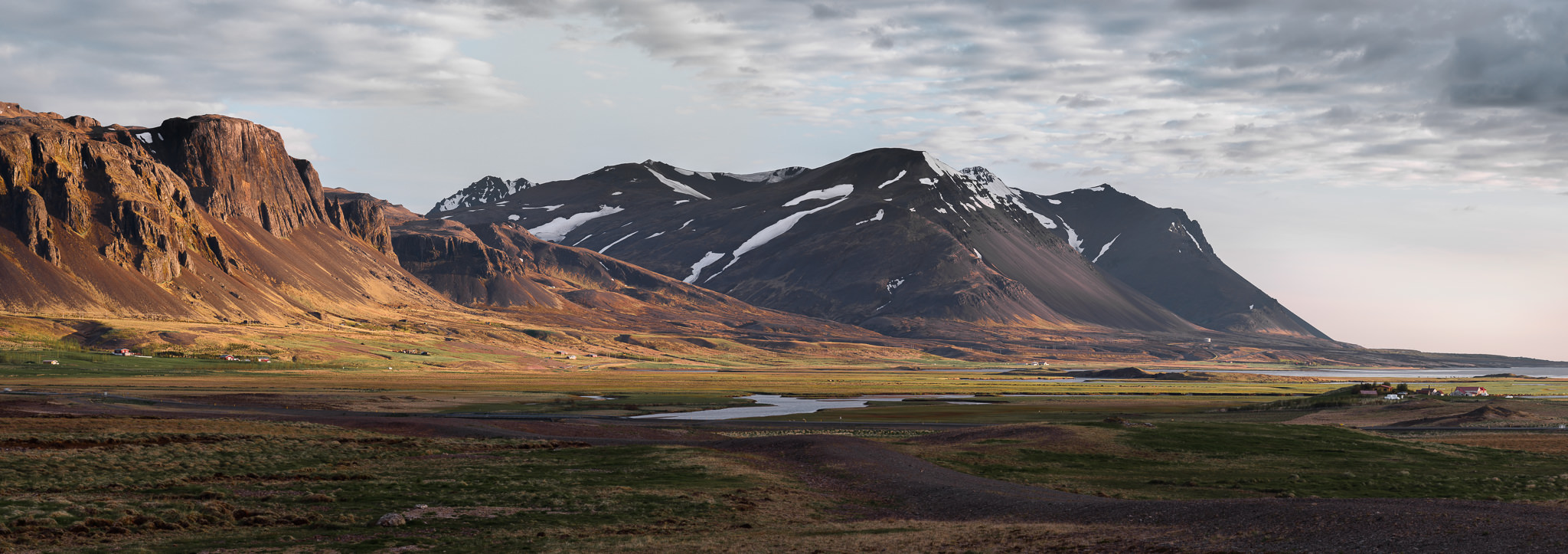
NIKON D800E + 50mm f/1.4 @ 50mm, ISO 100, 1/6, f/16.0
For other photographers — those who exhibit at shows and galleries — panoramas help to stand out against other prints on the same wall. Although it is not true in every case, many galleries want a consistent height for their images rather than a consistent length. This means that panoramas are displayed quite large, and thus are more likely to attract attention than typical images.
Not all photographers print their images, of course, so this comparison is not always valid. Still, you never know if one of your images will be in a gallery show at some point, and it is worth the effort to take images with a wide aspect ratio if this occasion arises. I recently visited a gallery of this sort, where the panoramas were far larger than the other prints. They were also, it seemed, among the most popular photographs on display. And, being stitched images, they were just as detailed — if not more so — than most of the other prints in the gallery. If your end goal is a print, keep the panoramic format in mind; panoramas lend themselves to large display more than any other aspect ratio.
3) Extracting Multiple Images
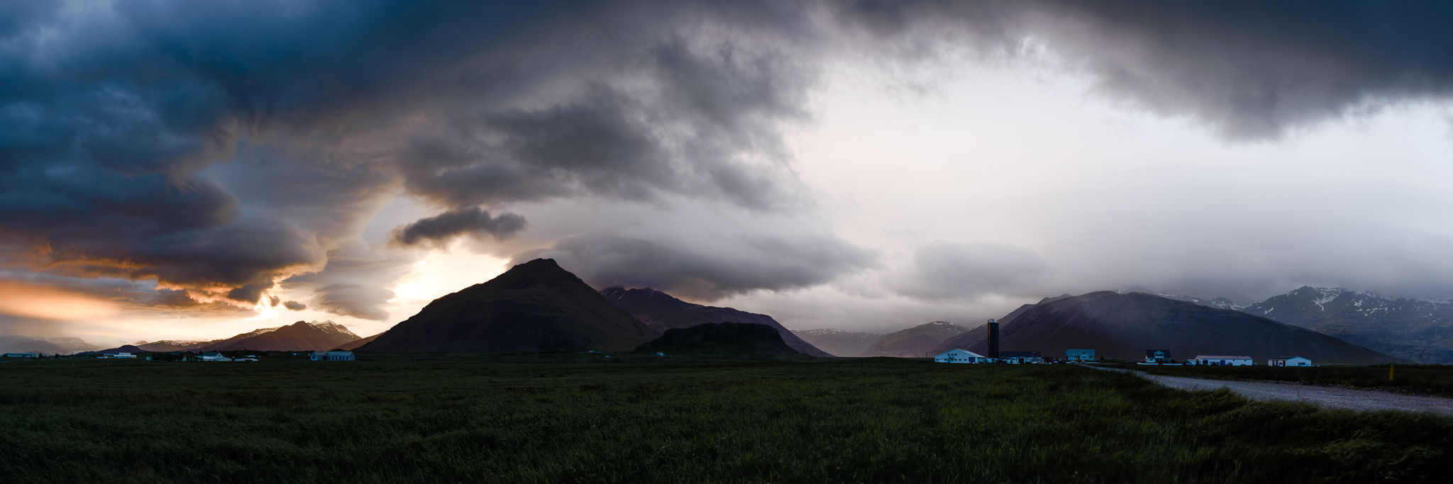
When I visited Iceland over this past summer, I saw some of the most magnificent landscapes of my life. Some locations actually were too beautiful for me to choose a subject quickly — they were almost overwhelming. In a few instances, I took massive, multi-row panoramas for my composition, rather than singling out specific subjects in the field.
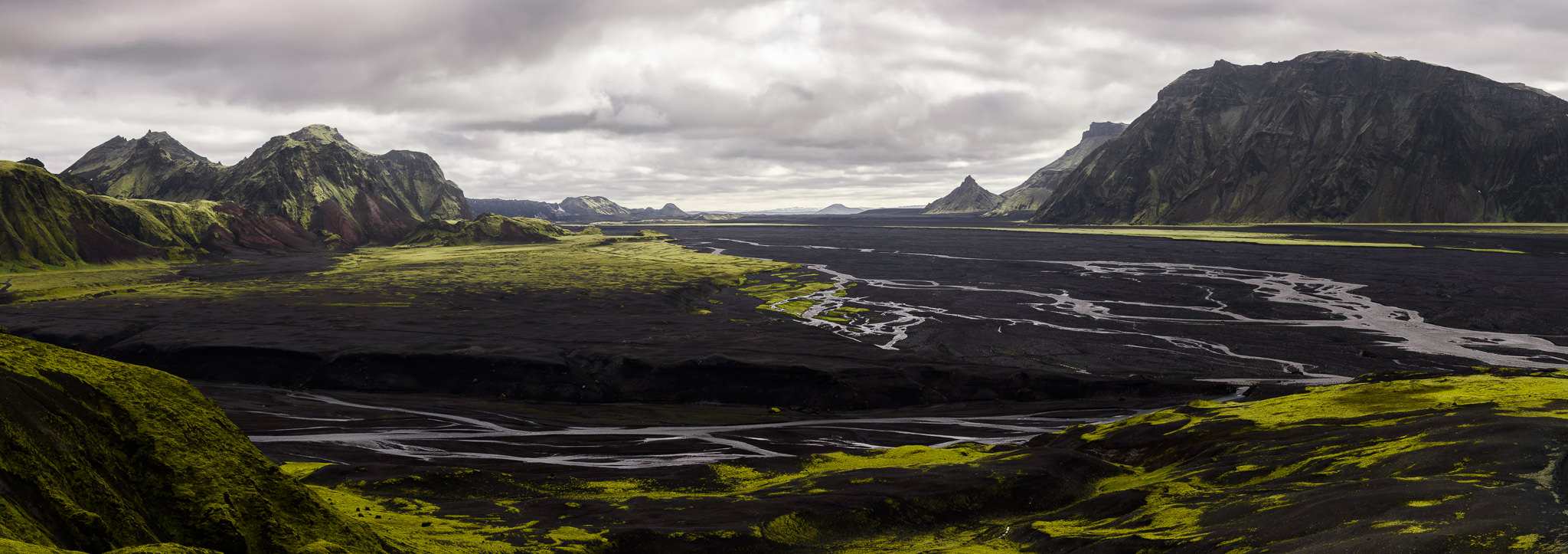
NIKON D800E + 105mm f/2.8 @ 105mm, ISO 100, 1/10, f/16.0
This is not my typical method of composition, but it is worth noting Iceland is so beautiful that I rarely needed to crop my vast panoramas at all — everything in the photo was interesting enough to keep. It also is worth mentioning that the photograph above, a prime example of this technique, is more than 230 megapixels in size — detail that is readily visible in a print. I can print this image about seven feet wide (over two meters) at more than 300 dpi, for example, and at least twice that size without a dramatic loss in quality. The “hidden benefit” is that I can extract ordinary 2×3 photographs from this massive panorama, and the insane number of pixels means that I don’t sacrifice image quality along the way. Consider the image below.
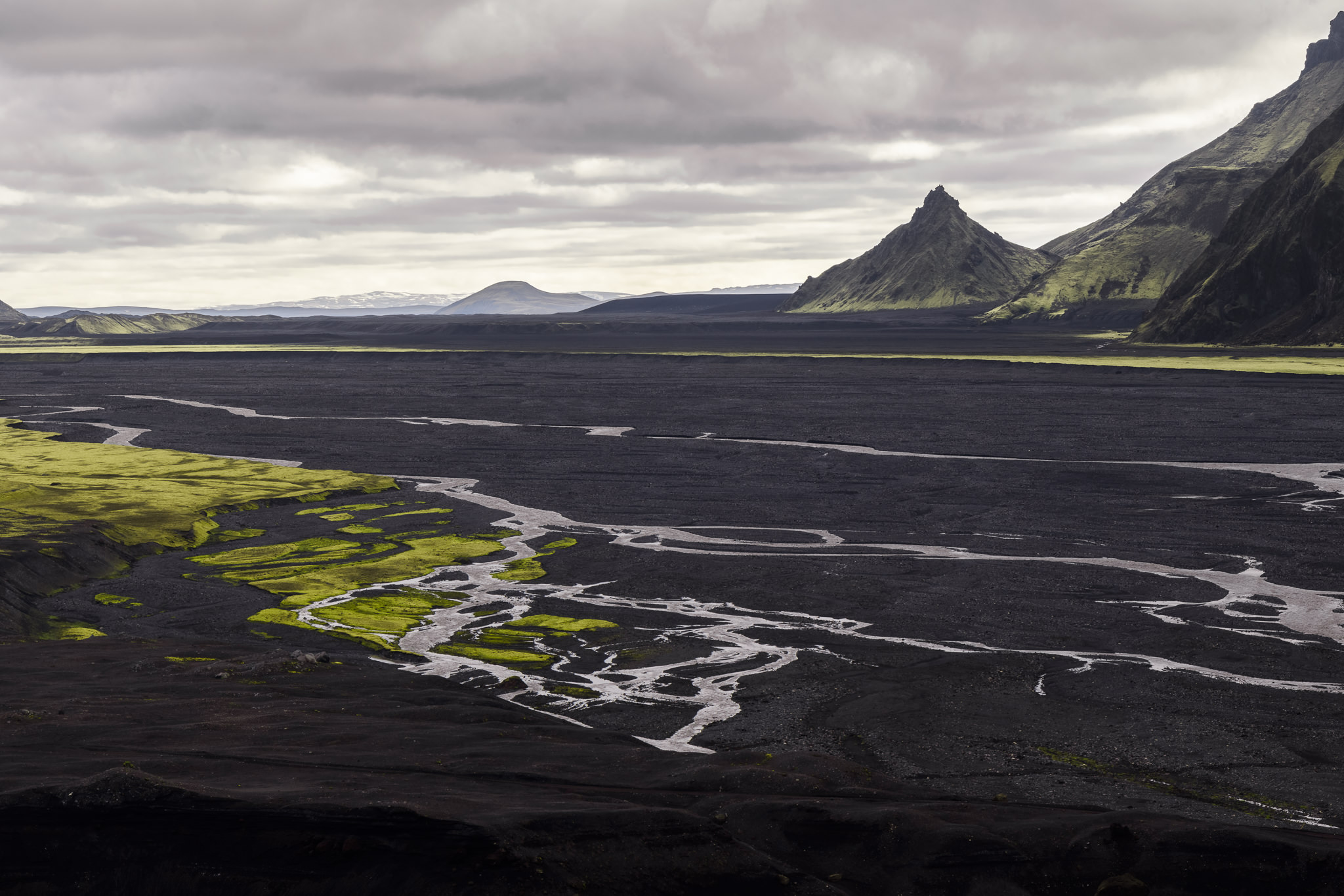
NIKON D800E + 105mm f/2.8 @ 105mm, ISO 100, 1/10, f/16.0
If I were making a set of 2×3 images from Iceland, I would be able to use this photograph without any issue. The perspective it brings is entirely different from the main panorama, and it stands on its own as an interesting scene. Plus, it is still more than 24 megapixels in size — more than enough to print at any reasonable size.
What if I wanted a 9×16 image for my desktop background? I can focus on another part of this panorama and get an equally interesting shot:
NIKON D800E + 105mm f/2.8 @ 105mm, ISO 100, 1/10, f/16.0
This image is, again, a crop from the original panorama. This time, I chose to focus on the mountains on the left-hand side of the frame, which look beautiful in the morning light. Again, this image works well as a crop, and it is not missing much from the original photograph. Plus, it’s more than 100 megapixels — large enough for a print of any size.
Although I do not recommend this approach for everyday photography, there is something to be said for extracting several individual images from a panorama. At the very least, it forces you to consider the large image as a combination of individual compositions, a different thought process that can help you decide what deserves inclusion in the frame. Plus, with the massive detail inherent in stitching photographs together, there is no significant loss in quality if you do choose to crop several versions of the image in post-processing.
These three extra benefits of panoramas, then — composing with more freedom, printing with a larger size limit, and extracting several images per frame — are not definitionally hidden, but they certainly aren’t as obvious as the other benefits of panoramic photography. No matter your preferred genre, panoramas can be a versatile tool in your arsenal — perhaps for more cases than may be clear at first.


0 comments: