Balance in Photography
alance is one of the least-discussed principles of good composition, but it is perhaps the most important. Photographers, consciously or not, make an important decision for every image: should the composition be balanced or imbalanced? To some degree, every photograph in existence has elements of both balance and imbalance, which makes this topic crucial for photographers looking to improve the strength of their images at the most fundamental level.
1) Left-Right Balance
When a photo is perfectly balanced, it means that the left and right halves of the photo draw the eye equally.
The left-right division is the only one in your photos which really matters in terms of balance — top-bottom balance has little effect on how evenly-weighted an image appears. In the same way, we see other people as roughly symmetrical, even though this is only true on the left-right axis. Thus, you can have a photo where all the subjects are along the bottom, and it can still be balanced if the left and right halves are equal in their visual weight.
Imaging putting a photo on a fulcrum — if the features of each side draw the eye similarly, the image can be considered balanced.
2) Balance vs Imbalance
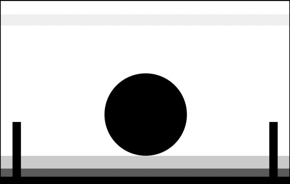
Balance, or a lack of it, inherently makes your images appear more or less serene. With a balanced image, the frame is more calm than one which skews visual attention to one side or the other. This makes logical sense, especially when you view the image below:
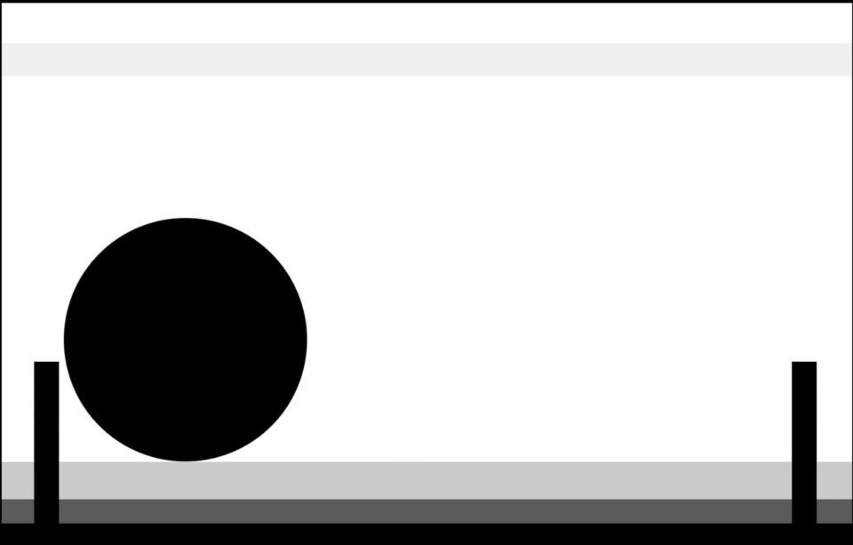
And the second one:
Although others may see it differently, the image on top appears far more peaceful to me. The image on the bottom, in contrast, is more tense — somehow, it doesn’t look “stable” in its current form, as though something in the frame is about to change.
Different people may prefer one image over the other, of course. For many, a tense image can communicate a story more effectively; for others, a balanced image is more peaceful and aesthetically pleasing. It all depends upon the mood you want to communicate.
3) Symmetry
The most obvious type of balance is one in which the image is identical on the left and right halves. Perfect, pixel-level symmetry is not possible outside of computer-generated images, but a nearly-symmetrical photo is more than enough for us to notice a balanced composition. Take a look at the image below:
Sure, the patterns in the stars are different on each side of the photo, but this scene is about as symmetrical as it could be. The subject is in the very center of this photo, and each side has essentially the same visual weight as the other. I even chose a square format to emphasize the balance of this image.
The main issue with symmetry is that most scenes do not have two identical halves. And, if you do work in a genre with readily-available symmetrical subjects (say, architectural photography), your images will grow old if you compose them all the same way.
4) Asymmetrical Balance
A photo does not have to be symmetrical to be balanced. Take the image below as a simple example — the sun is an important subject on the right-hand side of the image, but the wave pattern on the left draws the eye just as much:
Most examples are not this obvious, where each half of the photo has a subject that attracts equal attention. For example, the main subject could be on one side of the image, but several small subjects on the other side balance the frame. Or, the subject could be large enough that it spans the length of the image, effectively balancing itself.
For an image to be balanced, each side must call for the same level of attention from a viewer.
5) What Attracts the Eye?
To know how to balance a photo, you need to know what attracts viewer’s eyes in a photo. Here’s a short list:
- Areas of contrast
- Items that are in focus (especially if most of the photo is not)
- Bright spots
- Saturated items
- Warm (red/yellow) colors
- Large items
- People and (to a lesser extent) animals
- The eyes of your subject
- The direction that your subject is looking (even if it is an empty space, it gains visual weight because viewers will want to look the same direction as the subject)
This is by no means a comprehensive list, but it’s a good place to start. Any time that an item in the photo stands out compared to the rest of the image, it holds some amount of visual weight. If you are trying to balance your photo effectively, you must arrange the items so that they cancel out each other’s visual effects.
Again, like placing the image on a fulcrum, objects that are near the edges of your photo will carry more weight than those closer to the center. So, to balance two similar objects across the frame, you would place them at a similar distance from the center. Or, if there is just one important object in your composition, the most balanced composition places it along the center line.
6) Putting Balance into Practice
To change the balance of an image, take a quick look at the left and the right halves of your frame. Mentally note how many important visuals are on each side, checking for the items on the list above. Take care to think about the distance of each object from the center of the frame — even objects that do not normally draw attention will appear obvious if they are near the edge of your photo.
Adjust the composition to taste, making it more balanced by shifting the frame to have equal visual weight on both sides, or by excluding distracting objects from the composition altogether.
This takes practice, of course, but a lot of your knowledge about compositional balance is intuitive. This is why beginners tend to put their subject in the very middle of every frame, no matter the situation. We are inclined to take balanced photos by our nature, and proper practice can show us how to achieve this in more complex scenes.
Your photos do not need to be completely balanced to appear peaceful. Still, when you are composing a photo, it is important to realize that vastly imbalanced frames will cause tension with viewers. This isn’t necessarily bad, depending upon your goals, but tension is something that many photographers try to avoid in their images.
7) Imbalance
In some photos — in fact, many photos — a degree of imbalance is necessary. For a scene to have movement and tension, your composition almost necessitates that the scene isn’t perfectly equal from one side of the frame to the other. Take the below photo as an example:
In this frame, the photo is not evenly weighted between both halves of the composition. The left-hand side is brighter and more contrasty, plus it contains the main subject of the image. That said, the frame isn’t so unequal that it is distracting, and certainly not to the point of annoying a viewer. The tension of an imbalanced image is very appropriate for this specific photo.
8) Balancing Vertical Frames
On the surface, it may not seem particularly difficult to balance a vertical photo — use exactly the same techniques you would for a horizontal image, and the photo will be balanced.
However, vertical compositions give you less leeway between the center of the image and the edge of the frame. As discussed above, objects are far more distracting if they are near the photo’s outer boundaries. However, in a vertical image, objects that are barely off-center are already approaching the edge of the frame. This doesn’t make balance impossible, of course — vertical images often work just as well as horizontals — but vertical frames do require more care in balancing.
Of course, symmetry still works:
But other times, a vertical composition simply must be composed with its main objects near the center of the image. In the image below, the three main objects (the window, the boudoir sign, and the surfer) form a triangle centered around the middle of the photo. Perhaps the image is skewed more towards the left-hand side, but the surfer appears to move towards the right, giving both sides roughly the same weight.
9) Panoramas
On the flip side, it is extremely easy to balance a frame if you are shooting a panorama. Small shifts in an object’s left-right position, for example, are not nearly as influential as they would be in vertical images. Plus, it is easier to avoid the edges of a panoramic frame, giving you more space to shift around your composition.
The image below shows how simple it is to balance two objects across a panorama — the bird has a similar visual weight to the wave patterns, and both are placed roughly the same distance from the center.
10) Small Subjects
Sometimes, an image’s balance depends upon the size that the image is shown, since important details (ones which may shift the balance of the composition) are not visible at smaller sizes. This may seem like an unusual concept, but it makes sense in practice.
Take the image below as an example. When displayed at a small size, perhaps on a phone, it is somewhat hard to see the bolt of lightning on the left-hand side of the image. Without this lighting bolt, the clouds in the image would lean the weight of the image to the right-hand side. As it is, though, the image appears fairly balanced — but only when displayed large.
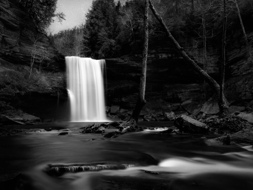
Another example of this effect is in the photo below. I wanted to create a peaceful landscape image with a well-balanced composition, but I found this particular scene to be tough to balance properly. Again, at a small size, the image appears to be weighted a bit more towards the right-hand side, although these effects are more subtle than in the photo above. But, when displayed larger, it becomes clear that the sky above the waterfall is filled with stars, pulling the viewer’s attention much more to the left-hand side.
The differences tend not to be as obvious as in these examples, but you should always be aware of the effect that display size has on the balance of your image.
11) Post-Processing
Perhaps the best way to correct (or accentuate) the imbalance of a photo is to use local adjustments in a program like Lightroom. This can be as simple as darkening a highlight that is too bright, or perhaps reducing the clarity of an object that stands out too much. It also could involve removing an object entirely, using the spot healing brush. Even cropping falls under this category, since you are moving around the frame in an effort to change the composition’s balance. The methods you use depend upon your post-processing skills, as well as the type of photographer you are — for example, reportage photographers are unlikely to clone out objects due to ethical concerns.
12) Conclusion
If you are meticulous with your compositions, you will be able to control the degree of balance in most scenes. And, if you find a scene that cannot be balanced effectively, you generally can use post-processing to highlight certain aspects of the frame over others.
Ultimately, whether you choose to balance your frame or not, it is important to be deliberate. Ask yourself about the type of image you want, then consider how balance (or imbalance) can help you achieve your goal. If you are subtle — especially when using imbalance — you will be able to make stronger and more intentional compositions, which boils down to an improvement in the quality of your images.


0 comments: